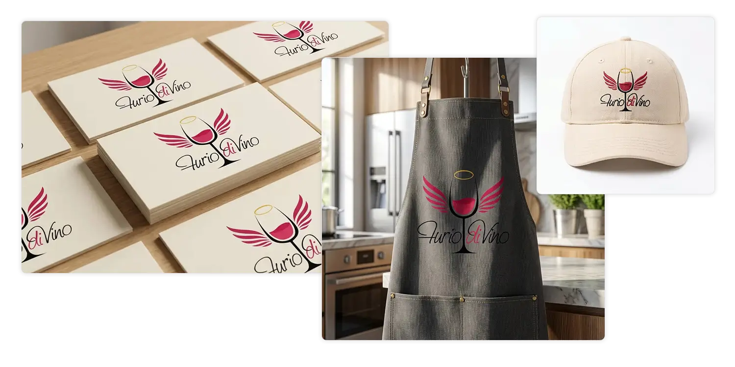
Logo designFurio DiVino - Sommellier
Furio diVino is a personal brand created for a friend sommelier, designed to express passion, expertise, and a playful yet refined personality within the wine world. The logo combines symbolic elements and typographic wordplay to create a distinctive and memorable identity.
Role
Graphic Designer
Client
Furio
Tools
Illustrator
01 - Brand Concept & Meaning
The identity elevates wine to something almost sacred - the logo transforms a stylized red wine glass into a symbolic icon through three layered elements:
- A minimal red wine glass as the central symbol
- A golden-yellow circle forming the rim, evoking a halo
- Two stylized wings extending from the stem
02 - Typography & Wordplay
The handwritten lettering "furio diVino" reflects personality and authenticity - essential for a sommelier's personal brand. The colored emphasis on "di" creates a deliberate double meaning:
- di-vino - of wine
- divino - divine
03 - Visual Balance & Style
The composition balances irony and elegance - the halo and wings add a playful narrative layer while keeping the mark clean, versatile, and strong as a silhouette across labels, social media, and print.
04 - My Role
Developed the full brand identity: concept, logo design, symbolic composition, typography customization, and visual storytelling - distilled into a compact, expressive personal brand mark.